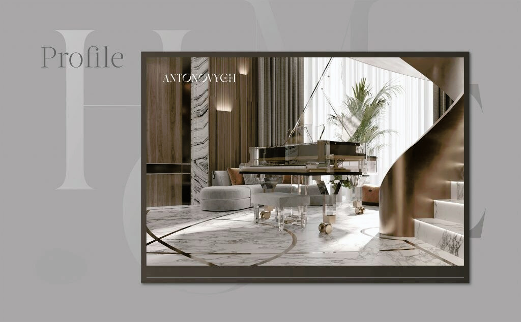
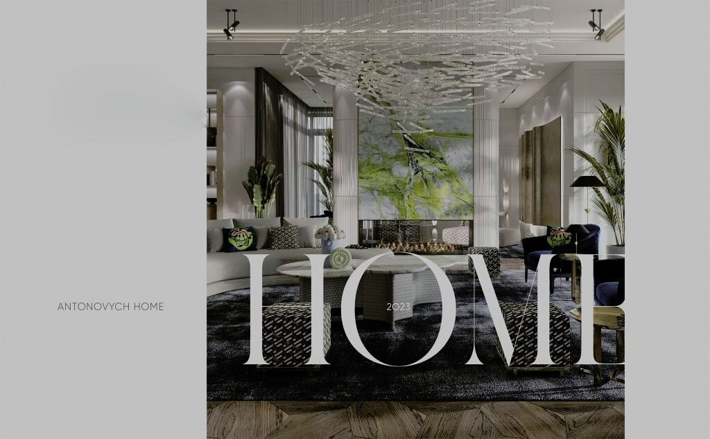
Antonovych group completed a rebranding project and created a new visual identity for its brand. The main brand elements, including the logo, graphic language, patterns, colours and fonts, were reconsidered and redesigned. Antonovych Home, led by Dmytro Korotchuk, is part of the international Antonovych group, which provides a full range of services for private homes and commercial real estate. Over the years, Antonovych group has changed by gaining experience and expanding its service areas, marketing, HR, sales and other functions. Significant growth required a reassessment of how the company should appear to clients and teams. The brand image needed to reflect the company’s current status, experience and position in the market. Antonovych group decided to develop a rebranding roadmap for Antonovych Home.
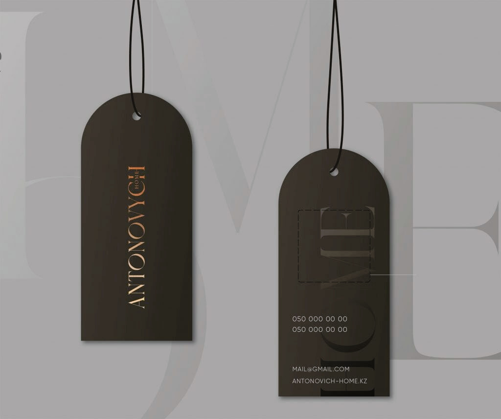
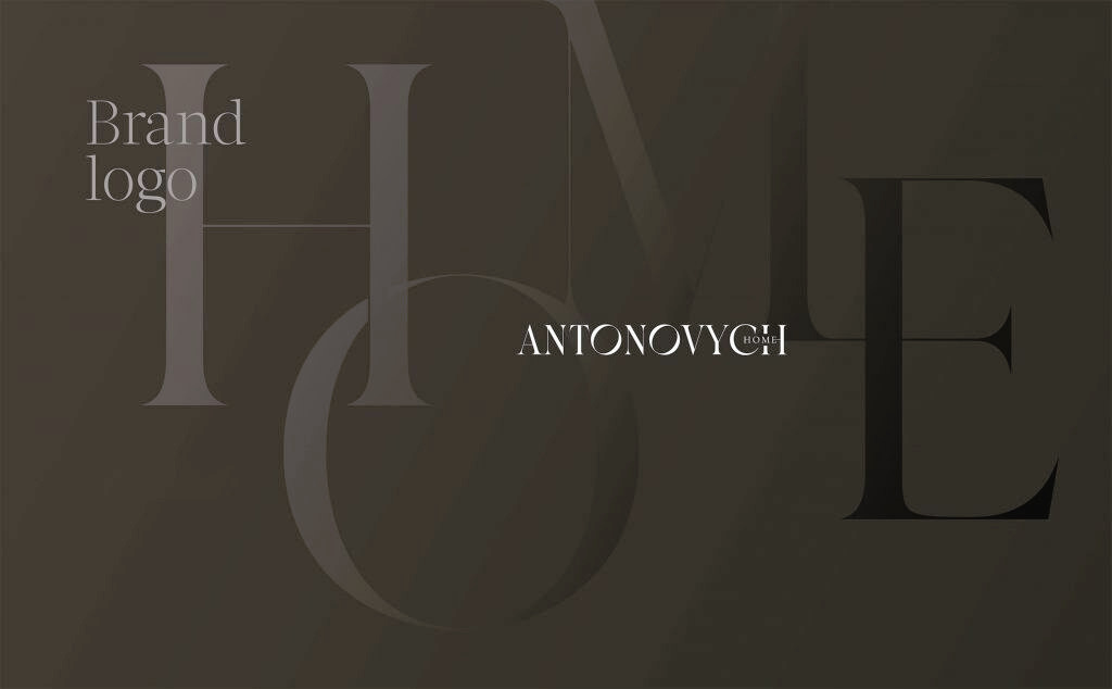
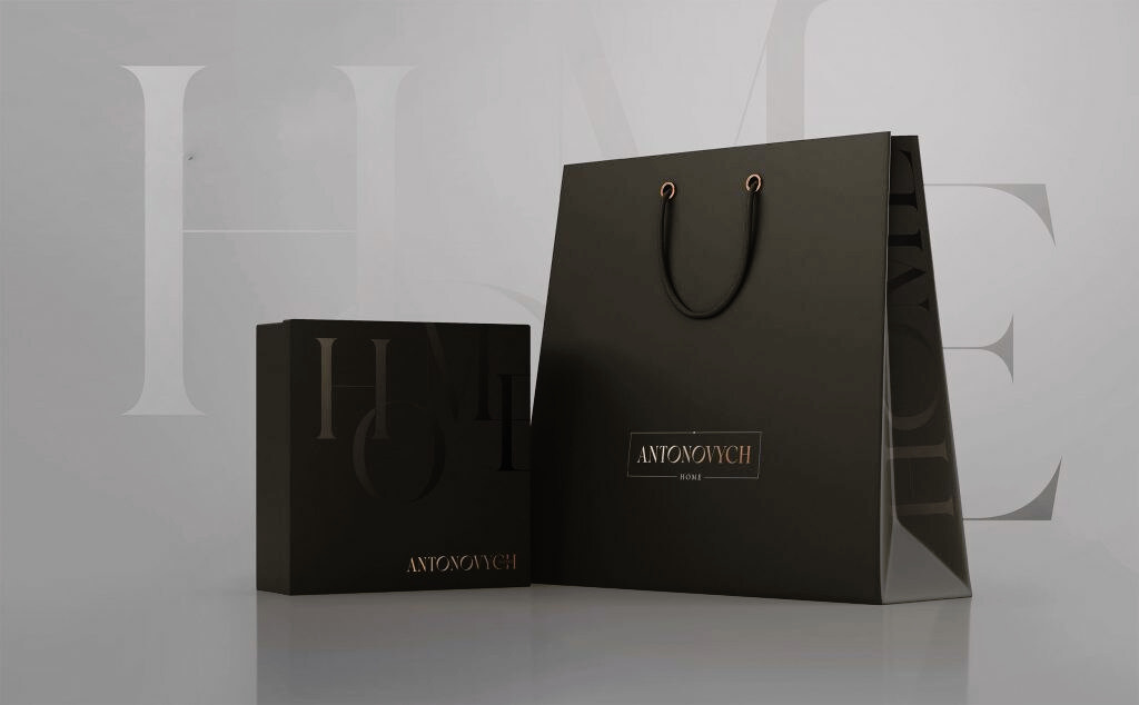
Antonovych Home required a multi-purpose design system that could provide a unified brand presentation across all business platforms. The new visual identity began with the most important elements of visual communication: a redesigned logo, a new pattern and new fonts. The logo redesign included research into identifiers that could reflect the brand image. The new logo became more contemporary and concise. The logo works well with the company portfolio, client presentations and branded company items, including stationery, packaging and accessories.
The logo combines naturally with different environments and formats while retaining the brand’s energy and individuality.
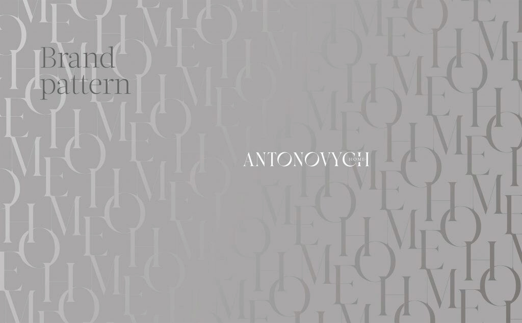
Antonovych Home developed a branded pattern as an important element of the visual identity.
The pattern provides a foundation for assembling brand elements and serves as a background for websites, stationery, photography and packaging. The pattern consists of an ornament formed by intersecting H, O, M and E letters.
The pattern carries meaning and highlights the brand’s values. The new font modernises the brand and creates a contemporary, expressive and delicate impression. The new visual identity creates consistency across every brand touchpoint after the rebranding.
The rebranding added new colour shades to the visual identity. The custom font and patterns gave the brand a contemporary tone and greater dimensionality.